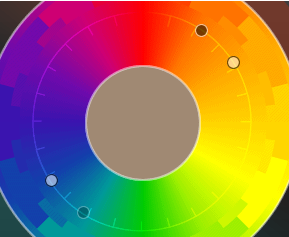
Contrasting Colors for Text and Background

About three weeks ago, I answered a question on StackOverflow about generating the most readable color of text on a colored background.
I suggested flipping the top bit of each component, (r ^ 0x80, g ^ 0x80, b ^ 0x80). This has the same effect as adding 128 if the component is less than 128, and subtracting 128 otherwise.
Another way to think about it is to imagine the 256x256x256 color cube. Inside that cube, erect another cube half as wide. One corner is at your original color and the diagonally opposite corner is the one computed above.
The questioner liked my answer the best, but I decided to experiment further. I wrote some JavaScript to compute that color. As you can see in the table of 549 colors below, it works well most of the time, but it’s not perfect.
Someone else suggested an earlier SO question on good-looking font colors. Looking at that thread, I decided to try inverting the HSL value to (h + 180, s, l + (l < 0.5 ? 0.5 : -0.5)). That works well too. Generally, it yields different colors than my first approach. It looks like one of the two always contrasts well.
I found that the most effective approach was to compute the gray-level intensity of the original color, (0.30*r + 0.59*g + 0.11*b). If it was dark, use white; otherwise, black.
Really, though, unless you have a requirement to work with arbitrary colors, you should pick your color scheme carefully. I found a really nice site this afternoon, ColorSchemeDesigner.com
Here’s the source of my colortable.